Wellness
Scroll to explore Selah
A quieter language for everyday restoration.
Case study · Concept direction
Selah.
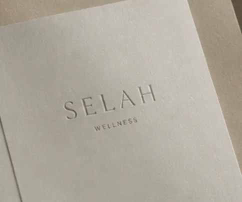
A concept direction for a wellness brand built around pause, ritual and the value of doing less, with more intention.
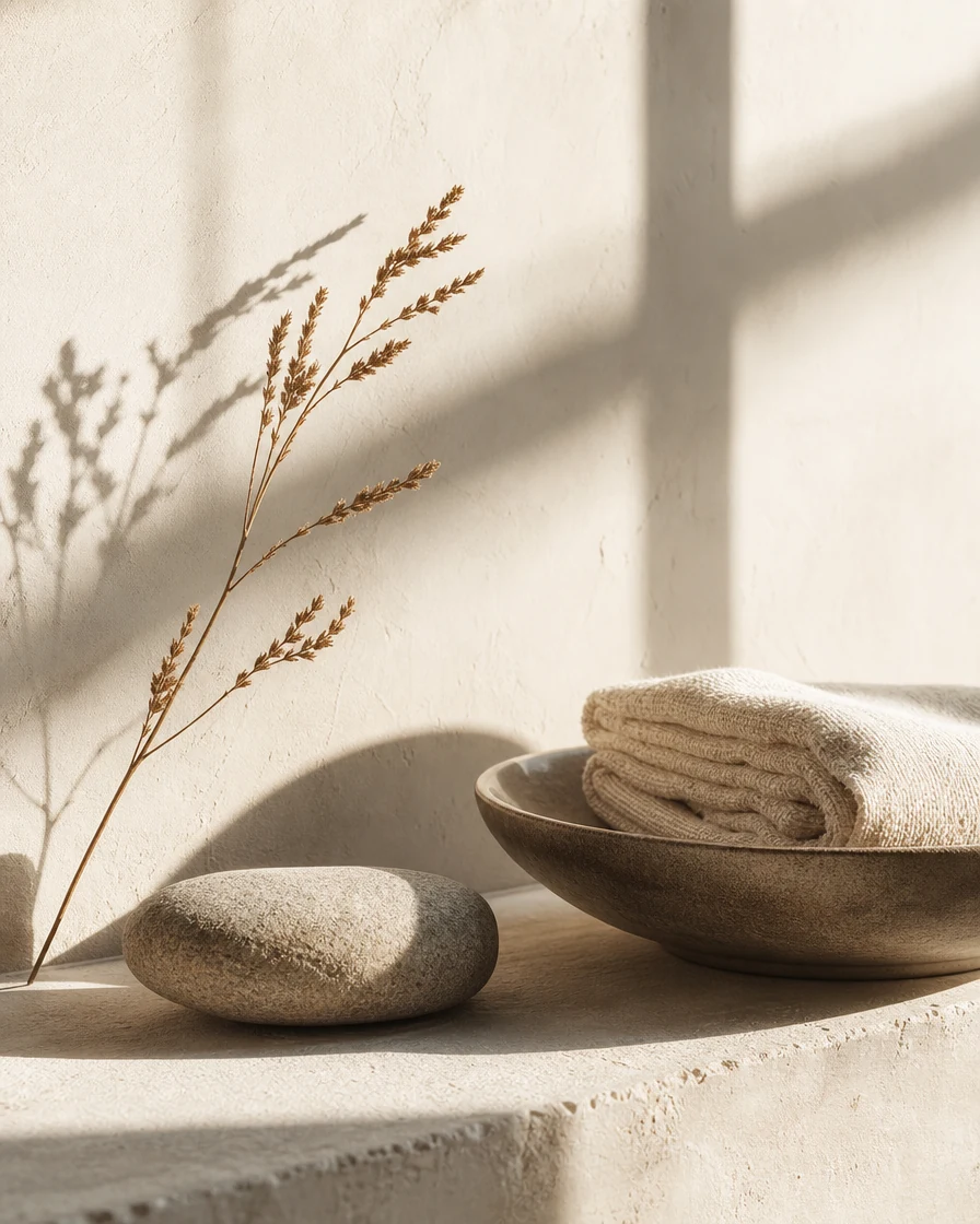
Selah uses warm limestone, oat and bone tones to create a visual environment that feels grounded from the first touchpoint. The identity is calm without becoming anonymous.
The art direction brings the same sense of care to the smallest details: a tactile surface, a considered crop, and enough open space for the message to land.